I have always had a deep love for art especially, graphic design and typography. If you walked into my house you would see Art is really special to me. Especially art that features words. Work Hard And Be Nice To People by Anthony Burrell is the first piece you will spot. Creatives have always been my favorite people and when I joined an online mum group and spotted graphic designer and brand strategist Ruth Perrin I was instantly besotted, this one-woman show is offering brand advice and designs as powerful as any top agency and I dreamed of working together. Ruth is the talented designer behind the No Mum Is An Island Inspirational Art Collection.
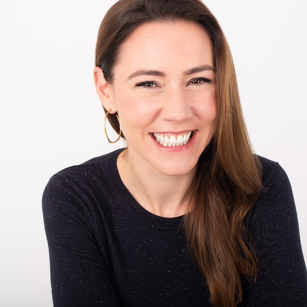
Hi Ruth, Welcome to No Mum Is An Island. I am a great believer that no mum or dad should have to do everything themselves, we can’t possibly know it all, and we need all the support we can get, there is a wealth of information out there to help us upgrade our parenting experience, to make our lives easier and this website is a hub for just that! We love that you have created a bespoke business offering agency standard services that allow you to spend more time with your children.
Can you tell us a bit about your love for design and branding?
I decided at 12 that I was going to be a graphic designer. Even before I properly knew what it even meant! It started with a calligraphy set that I received at about 10. I love letters and words, simple as that! I’m a visual thinker, so I took Fine Art after my A-levels but the love of letters never left me so that got me into graphics after that. But I’ve always had a strong connection with words and images, and that is where my love of branding comes from. The combination of icons, images and clever words makes up so many stupidly great brands.
But it runs deeper than that to me.
To REALLY understand your brand, you have to know all aspects of what that means – your reason for being and who your people are, then we can talk about colours, fonts, tone of voice and impact of all of those elements put together until the cows come home!
How important is it for Mum businesses to start with a clear brand identity?
A strong visual identity is a representation of YOU, what you stand for and who you want to attract. Don’t go for a purple colour if it reminds you of the night terrors you had as a kid at your Aunty Phyllis’ house in 1985. Part of being clear about your brand is to deconstruct it a little in order to put it back to together. A strong vision with strong brand foundations will make your brand stand out for the right reasons
What makes up a good brand? Can you give us some pointers?
The primary use of a logo is for your customers to visually recognise your business in the wild. A bit dry in its explanation but still a vital part of your business. The secondary (but no less important) use of a logo is to appeal to your ‘people’ and to spark an emotion about your brand.
When I see some ‘logos’ it makes me cry a bit on the inside. They just aren’t logos. Fiddly bits of type jumbled together is not the best foundations for a brand. A logo should evoke emotion in a good way, not present a visual attack on the eyes! Simplicity, clarity and style is a really good place to start. Think about how it will present in smaller formats and in monotone (black and white). Does it still work? Thin letters will struggle for legibility and bulky letters will look overwhelming when really small.
Colours are super important. There is a reason car manufacturers like to use blue and fast food chains like the colour red. Choose your colours wisely, you have to like them because you will be using them. A lot!
The logo and colours are just the tip of the iceberg of your brand. They’re the face of the brand. How you talk to people, customer service, tone of voice, social media posts are all you (and your team) representing the brand. It’s a holistic view of most aspects of your business that make up your brand – from van signage to direct mail to handwritten notes in orders.
Can you give us some examples of your favourite mum brands and what it is they get so right?
Mutha.Hood is just excellent. It ticks all the boxes for me, visually I know what I’m getting and it matches her tone of voice and visual content.
Her logo is simple, fun and strong. Her products are simple, fun and strong.
Scamp and Dude are another mum brand that has just nailed the whole shebang.
Tell us what services you offer to brands looking to make an impact?
I am a lucky girl. One, I can multitask (most women can. It’s in our makeup. Seriously, our brains receptors are wired that way to be able to cope with more than one thing at a time!)
Two, I love the connection of words, images and ideas. It makes for one hell of a sparky brain party in my head.
I specialise in uncovering all the behind the scenes stuff to help make your brand stand out to everyone else. I LOVE a good brainstorm session to uncover a niche, a USP (unique selling point) or tag line that separates you from the crowd. Once you have all the knowledge around WHY you do what you do and apply that to WHO you are talking to then we can get busy with the brand visually. This happens before we talk about logos and all the lovely nice branding stuff that we are familiar with. I really do love being the biggest cheerleader. I treat your brand like it’s my own and I get just as excited when things start falling into place.
You can find out more about Ruth’s services HERE and follow Ruth on Instagram